← All entries
Highway Signs, Ranked From Best to Least
I'm still thinking about Hawaiian Interstate Highway signs. And many, many more!
After reading about their interstate highways, I fell down the Wikipedia rabbit hole and found myself on the numbered highway signs article. Then spent way too much with the table below.
I've ranked the highways signs from best-to-least, using the following criteria:
- Overall aesthetics, including shape & color
- Quality of the typography
- Line & border weights
- Any iconography they featured
- Ability to communicate where you are
| Rank | Icon | Name | Reasoning |
|---|---|---|---|
| 1 | 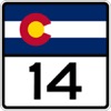 |
Colorado | The gold star: has the state logo, is colorful, and neither get in the way of the clean numbering |
| 2 |  |
Kansas | A close second: the Sunflower State shines by integrating their state flower in a balanced design |
| 3 |  |
New Mexico | Another great use of a state symbol. Subtle invocation of the red sun symbol of the Zia pueblo tribe |
| 4 | 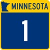 |
Minnesota | While displaying tiny state is redundant with also showing state name, this one stands out for both unique color combination and clear contrast |
| 5 | 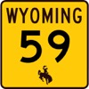 |
Wyoming | I went back-and-forth with this one, since it invokes construction or caution. But its color stood out, and its icon is restrained |
| 6 |  |
Pennsylvania | The first of the classic black-and-white designs, there's no mistaking you are in the Keystone State |
| 7 | 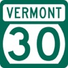 |
Vermont | This design is more-unusual versus unique, as it feels antique in a good way. One nitpick is it feels too compact and could use a bit more padding above / below the number |
| 8 | 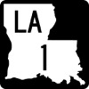 |
Louisiana | I spend a lot of time driving this state, and I've always appreciated that the state abbreviation vs. full word is easy-to-interpret while driving |
| 9 | 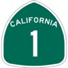 |
California | The first of the unique shapes, this has the feel of a national park sign. I wish the state name wasn't touching the edges, tho. |
| 10 | 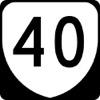 |
Virginia | I like it when highway signs feel like shields. Nothing beats a good U.S. route sign, but this provides competition! |
| 11 | 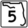 |
Florida | The first of the outline designs. Although it's strange the west coast is missing (an omen?), there's something pleasant about reading Highway Gothic here |
| 12 | 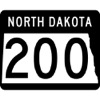 |
North Dakota | This state is the perfect shape for displaying digits left-to-right, and doesn't look strange when stretched out for longer highway numbers. |
| 13 | 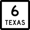 |
Texas | My home state, so I'm biased. It benefits from emphasizing the number above the state name, making it easier to gather the most-important detail while passing by at 90 mph |
| 14 |  |
Montana Secondary | The arrowhead shape has texture and invokes the shield feel I dig so much |
| 15 | 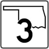 |
Oklahoma | While I normally dig the outline designs, this one ranks lower than Florida because the overlap between shape and number makes it difficult to read |
| 16 | 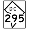 |
District of Columbia | The first of the vertically-oriented rectangle designs, while tricky to pick out the number, the orientation of the outline is eye-catching |
| 17 |  |
New York | Another shield, so it gets my upvote. It might have been higher than Virgina if it didn't feel so squeezed-together |
| 18 | 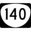 |
Oregon | It is the little sister of the Virginia shield and suffers from being too rounded, making it shaped like a giant Viagra |
| 19 | 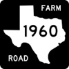 |
Texas Farm to Market Road | The black background makes it stand out from bright blue skies & invokes the state's classic license plate design |
| 20 | 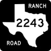 |
Texas Ranch to Market Road | Basically the same thing as the Farm to Market Road sign, but I guess I like farms more than ranches |
| 21 | 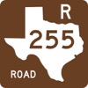 |
Texas Recreational Road | I'd never seen this one before, but I always love seeing any highway sign that uses this shade of burnt umber |
| 22 | 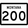 |
Montana | Straightforward and to the point, with good typography and the most-acceptable of border weights |
| 23 | 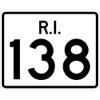 |
Rhode Island | This one breaks all the typography, border, and white space rules, but I can't stop thinking about the periods after each initial |
| 24 | 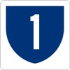 |
Puerto Rico | A color shield, with great contrast. The only thing that would make it better is including a border |
| 25 | 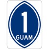 |
Guam | When I see this sign, I think surfboard, which might be appropriate for a tropical island |
| 26 | 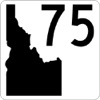 |
Idaho | A unique design, I like how the state shape hugs the edges and corner, and it has just the right amount of negative space |
| 27 | 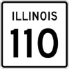 |
Illinois | Basically Montana on Ozempic, my old home state might have ranked higher if they used the correct border weight |
| 28 | 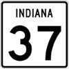 |
Indiana | Leave it to Indiana to be a pale imitation of Illinois, everything is the same except for the numbers that are too large |
| 29 | 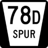 |
Nebraska Spur | The inconsistent font sizes still bother me, but I dig the sharpness of the shield shape |
| 30 | 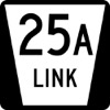 |
Nebraska Connecting Link | The twin brother of the Nebraska Spur. We have spur routes in Texas, and I've always been fascinated by the term |
| 31 | 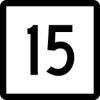 |
Connecticut | Great font and border weight. It loses points because if I were unknowingly dropped into the state, I'd have no clue where I was |
| 32 |  |
West Virginia | Similar to Connecticut, its border weight is just a tad too large |
| 33 | 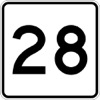 |
Massachusetts | And similar to Connecticut and West Virginia, its border weight is way too slight |
| 34 | 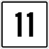 |
Maine | Leave it up to Maine to be the "Massachusetts we have at home" |
| 35 |  |
Maryland | This design feels very East Coast, but I have no words to explain it. Maybe because it feels dreary. The horizontal line is way too thick |
| 36 | 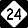 |
North Carolina | While it's a unique shape, because of how it is oriented, it constrains the number too much |
| 37 |  |
Missouri Supplemental | The only design where letters (and only letters!) are used, it delivers information sternly & with confidence thanks to its thicc border |
| 38 |  |
Utah | The top of the bottom half of the ratings, it's all downhill from here. Brownie points if you understand the what and why for this symbol |
| 39 |  |
Hawaii | The "Minimal Utah" that uses the same symbol shape, but has a strange balance of white space that makes it look like a hardboiled egg |
| 40 |  |
Nebraska | They crammed the number into the state name, just so they could add a Conestoga wagon icon that no one can make out |
| 41 | 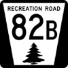 |
Nebraska Recreation | I have a hard time believing there are any trees in Nebraska! |
| 42 | 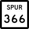 |
Texas Spur | While Texas secondary highway signs flip the state name / number order, which is clever for discerning them from state highways, we have way too many of these |
| 43 | 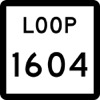 |
Texas Loop | Texas loops can have up to four-digit numbers, which steadily erode sign readability |
| 44 | 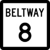 |
Texas Beltway | This is the only beltway in Texas. Besides annoying me because it has to do with Houston, the lettering here is also way too narrow |
| 45 | 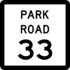 |
Texas Park Road | This might have been a great design if it used the same brown color scheme as Texas Recreational Roads |
| 46 |  |
Texas NASA Road | There is no reason for this to exist in a world of spurs. The locals agree, fighting to rename it NASA Parkway |
| 47 |  |
Iowa | A literal "round peg in a square hole", this might have rocketed up the list if they made the whole thing round. And there's no clue to which state you're in |
| 48 |  |
U.S. Virgin Islands | It's hard to call them a paradise when their signs try so hard to emulate Iowa's |
| 49 |  |
Mississippi | I'm impressed that anyone in Mississippi knew what a circle was |
| 50 | 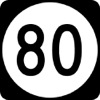 |
Kentucky | The numbering typography backslides as you hit the two-digit mark. These numbers are way too narrow |
| 51 |  |
Delaware | This example only has one digit, and even then the number is incorrectly narrow |
| 52 |  |
Vermont Town | This looks nothing like their regular green state highway signs, you might not know you're in Vermont |
| 53 | 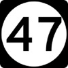 |
New Jersey | The fact they cannot even center the number, causing it to collide with the shape edge, is the biggest of party fouls |
| 54 | 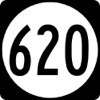 |
Virginia Secondary | Kudos to this one for sticking to the round shape, refusing to stretch & accommodate any long numbers |
| 55 | 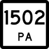 |
Texas Principal Arterial | It's quite possible you would think this is a Pennsylvania state highway marker |
| 56 |  |
Wisconsin | Their O.G. marker was a inverted triange. But to make room for the numbers, they overlay a rectangle |
| 57 | 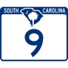 |
South Carolina | Paper-thin borders, a non-contrasting blue color, tiny letters, and not one but two symbols, overlapping each other for improved illegibility |
| 58 | 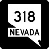 |
Nevada | I like the white state silhouette over black background, but the cutout for state name makes it look like there was a border incursion into California |
| 59 | 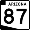 |
Arizona | They make the best of a boring state shape, but I dislike how the shape distorts horizontally as the number sizes increase |
| 60 |  |
Arizona Loop | The word "LOOP" here is bigger than the "ARIZONA" on their regular signs |
| 61 | 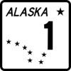 |
Alaska | Total slop, made by a graphic designer who was told what to do by the creative director lording over their shoulder. Only ranked where it is because the rest are worse. |
| 62 |  |
Missouri | They preserve the state shape when hitting two-digits, at the cost of legibility. Then increase the proportions to accommodate three-digits, yet still keep the narrow typography |
| 63 |  |
Arkansas | The upper-left of the state shape cuts into what would otherwise be a clean, properly-thick black border |
| 64 |  |
Georgia | The Georgia shape & size gets right what Arkansas got wrong, but it's cursed with the narrow typography I dislike |
| 65 |  |
Ohio | There's too much variation in Ohio's border to render well on their signs. (sigh) Not everyone can be Texas! |
| 66 | 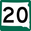 |
South Dakota | Instead of stretching out the state size as numbers get larger, they instead go the shrinking route, even when the number length doesn't necessitate it |
| 67 | 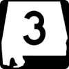 |
Alabama | If we know that numbers are eventually going to increase beyond one digit, why not start with an exaggerated horizontal dimension? |
| 68 | 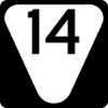 |
Tennessee Secondary | Shaped like a yield sign, there's something icky about the number placement & waste of space below it |
| 69 | 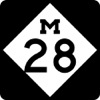 |
Michigan | The diamond points are too sharp, the numbering collides with the shape border, and using serif font gets you an instant red card |
| 70 |  |
American Samoa | Combining white on green with tiny typography makes this sign impossible to read at high speed |
| 71 | 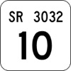 |
Pennsylvania Quadrant | The overly-slight border weight on this sign makes the baby Jesus cry |
| 72 | 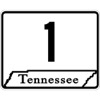 |
Tennessee | Narrow border, microscopic serif font, and overlapping the bottom edges of the state and border. |
| 73 | 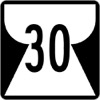 |
Northern Mariana Islands | I have no idea what this shape is, and neither does the internet |
| 74 |  |
Washington | I chuckle thinking how toxic it would be for their neighbors if the State of Washington were actually shaped like a head |
| 75 | 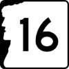 |
New Hampshire | I know they love their old man, but everything else about the design is poor |